What’s New with Website Design in 2022
- 23 Jun 2022
- Articles
Web design has been all about inclusivity and storytelling in recent days, and today's website has not only become much more advanced – it is increasingly being seen as relatable to everyone and has something significant to say about a movement, a person, or an organisation. But as you may well know, trends come and go – so it's a matter of choosing which trends to pay attention to and which ones to consider in the hopes that they will stay and work for you. There are some trends worth noting, so to make it easier to choose the right one and incorporate it into your website, here's what's new with website design in 2022.
• The inclusive website
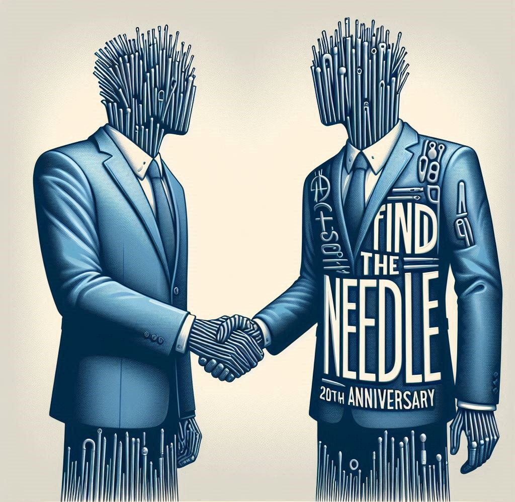
An inclusive website speaks to everyone in an audience. The opposite of exclusive, inclusive reaches out to all – and it is all about becoming globally recognised. Being inclusive is taking every part of the website design process into consideration, from the strategy of targeting a website audience to the website's tone down to the personalisation. It also includes defining your brand's graphic language so it can easily accommodate every gender, every experience, every situation, and point of view. For instance, illustrations and images are increasingly appearing in a sexless format with a non-gender appearance, which offers a lot of diversity – anyone can relate to it. In addition, the following year is set to increase the number of illustrations, characters, and avatars that are not 'human', which leads an audience to question reality at its core.
• Scrolling horizontally
We are all familiar with vertical scrolling – it's the usual way one scrolls through a website. But a new trend is taking the world by storm – scrolling horizontally instead of vertically. It comes in an interesting format, especially with how images and texts interact, and it's the perfect way to showcase portfolios, maps, catalogues, and similar formats. Undoubtedly, it's much more interesting to view projects, visit galleries, and explore cities with 'sideways' navigation. Doing it properly can make your website a lot more fun, appealing, and unforgettable, as confirmed by web design Cheshire experts such as It’sEeze.
• Brutal typography
Think of a bold print that brings to life the dominance and ruggedness of a word, and you've got brutal typography. But it's more than this – it's also about typography that is the exact opposite of today's minimalism and optimism (seen on plenty of websites) – it is a style that offers no apologies, in direct contrast to modern and appealing typography. For example, you can create a rugged grid, use letters for building segments, or use it to make a website appear wilder and freer. Think huge typography that makes the info more accessible and easily viewed by everyone.
• The nostalgic website
Another trend many people are talking about is the nostalgic website – this has been on the rise in years past, culminating in today's website, which is all about remembering and reminiscing. It's a comforting and all-too-familiar experience, and everything has a more 'analogue' feel and grain, a retro finish, softer textures and lighting, and even pastel colours. It's about creating a typeface that's 'curvy' and romantic and accentuating it with soft images to develop a sense of closeness and cosiness.
Image attributed to Pixabay.com


