 Add My Company
Sign In
Choosing the right colour for your office
06-08-2024
Picking the right colours for your office or interior can be a challenge. When faced with swaddles of swatches and an unending array of hues, making a furniture colour decision can be overwhelming to say the least. This, coupled with the knowledge that an incorrect use of colour may be detrimental to productivity, can lead to throwing in the towel and sticking to neutral, monochromatic tones.

For now, though, keep that towel in your hand while we explore 7 cultural and psychological concepts regarding colour, which may well spark inspiration in you…
Colour Psychology
It’s a well-established fact that colours can influence our moods, emotions, and perceptions, but the effect of each colour can vary widely between different cultures. For example, here in the West, the colour red is associated with passion, anger, and urgency, whereas in India it is considered the colour of purity (hence its use for bridal dresses), and in China the hue is thought to bring good fortune.
As the workplace can be a mixing pot of cultures and perceptions, it is crucial to consider cultural connotations when choosing colour. Below are just a few examples of cultural influence on colour perceptions:
Western Colour Theory
We’re likely all familiar with the terms ‘green with envy’ and ‘seeing red’. In Western culture, colour is so entrenched in our perceptions of emotion that just mentioning that, for example, you’re ‘feeling blue’, will immediately clue the other person in to your emotional state.
If you’re looking for a quick guide, we’ve whipped up the below graphic with 3 keywords for each colour:
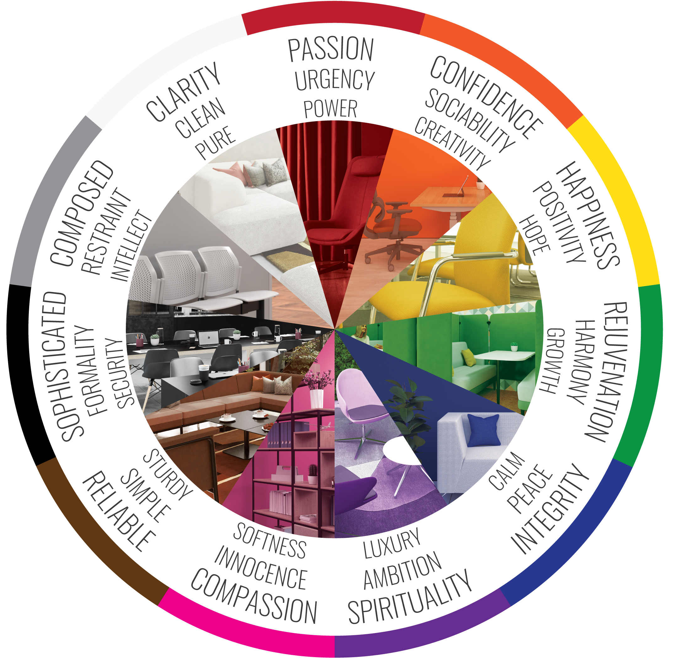
Red: Passion, urgency, power ; Orange: Creativity, sociability, confidence ; Yellow: Happiness, positivity, hope ; Green: Growth, rejuvenation, harmony ; Blue: Calm, peace, integrity ; Purple: Luxury, ambition, spirituality ; Pink: Compassion, innocence, softness ; Brown: Sturdy, simple, reliable ; White: Clean, pure, clarity ; Grey: Intellect, composure, restraint ; Black: Formality, sophistication, security
Feng Shui
Travelling over to the East, we find the philosophy of Feng Shui. To practice Feng Shui is to arrange pieces in your spaces for harmony with the natural world.
Feng Shui assigns colour to certain aspects of life, known as areas of the ‘Bagua’. By positioning objects of a particular colour in specific areas of a room, you strengthen the energy of these areas and improve their influence in your life. Of course, there is more nuance to this philosophy than colour, and we encourage you to explore deeper if you find yourself interested.
There’s a fantastic full guide to Feng Shui and its principles here, but for a quick introduction, here are the basics of the Bagua and their colours:
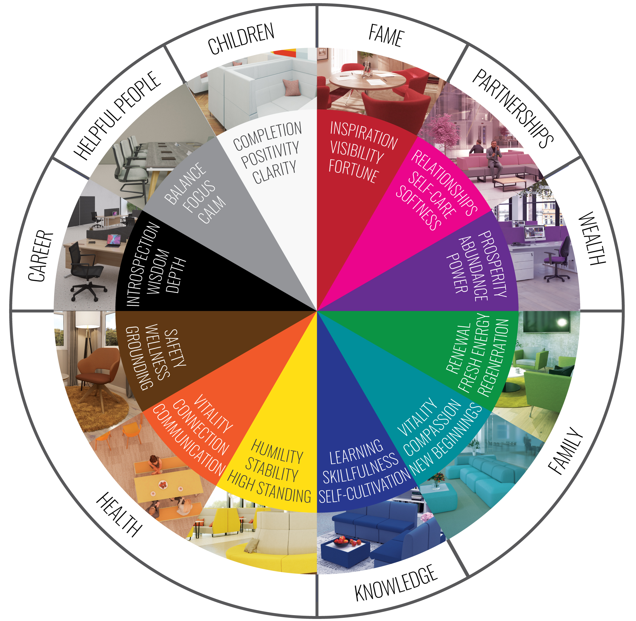
White: Clarity, positivity, completion. Children bagua. | Black: Depth, personal exploration, wisdom. Career bauga. | Grey: Benefactors, travel. Helpful people bagua. | Dark Blue: Learning, self-cultivation, skillfulness. Knowledge bagua. | Light Blue/Teal: New beginnings, compassion, vitality. Family bagua. | Green: Renewal, regeneration, fresh energy. Family bagua. | Red: Visibility, inspiration, fortune. Fame bagua. | Pink: Self-care, softness, relationships. Partnerships bagua. | Brown: Grounding, stability, wellness. Health bagua. | Yellow: High standing, humility, stability. Health bagua. | Orange: Vitality, stability, social connection. Health bagua. | Purple: Power, prosperity, abundance. Wealth bagua.
Indian colour symbolism
India is a nation bursting with vibrant colour and powerful symbolism, fuelled by culture and religion. While there is some variance in the meaning of certain colours, due to the diversity of culture and religion throughout the subcontinent, there are some colours that retain a more universal interpretation. Below is a summary of these more universal connotations:
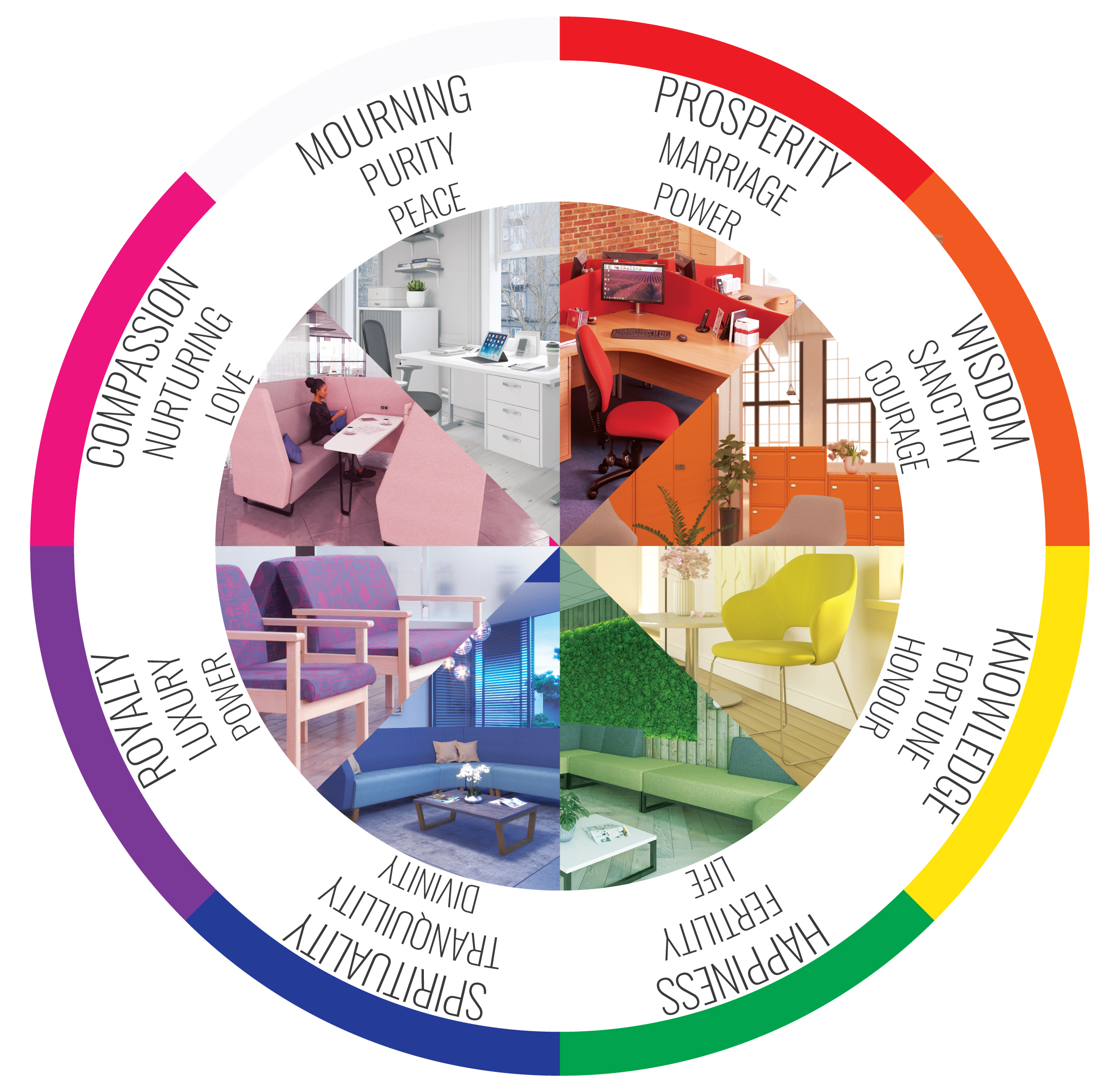
Red: Marriage, prosperity, power | White: Mourning, peace, purity | Orange: Courage, wisdom, sanctity | Green: Happiness, fertility, life | Blue: Divinity, spirituality, tranquillity | Yellow: Honour, knowledge, fortune | Pink: Love, compassion, nurturing | Purple: Royalty, luxury, power
When choosing colour based on the emotional response they elicit, it’s crucial to bear in mind that our responses to colour are shaped by our cultures, beliefs, and religion. While, on a universal scale, our brains do have similar responses to the stimuli of certain colours, the meanings behind colour are highly subjective. In this context, some colours are ‘safer’ than others – green, for example, almost universally represents growth, rejuvenation, and new beginnings; whereas red is considered fortunate in one context and abrasive in another. In summary – don’t expect your whole workforce to respond as intended to your colour choice!
Colour Trends
For companies that wish to be perceived as modern and on-trend, opting to decorate your space with trending colours is an effective method. Whether you follow Pantone’s annual ‘Colour of the Year’, or pursue the expertise of an interior designer, keeping up with the whims of each colour trend is an effective (if potentially costly) way to exude modernity and style.
Of course, something to keep in mind when pursuing colour trends is that trends can be fleeting. A colour can go out of style just as quickly as it comes in and can be influenced by media and culture at the drop of a hat (or a blog). Unless you stick to longer-term trends, such as ‘colours of the year’, you may find yourself financing a redecoration more often than is practical.
Concept-led Colour Palettes
While each colour has cultural and psychological influence, you can exert your own influence on the meaning of colour via concept-led palettes. In a nutshell, the colours you choose can represent anything you want, when applied in the right way. Colours can be used to tell a story about your company, its history, or its mission.
For example, an organisation proud of its British heritage could incorporate the red, blue, and white of the Union Jack throughout its spaces. Conversely, an eco-conscious company could incorporate the greens and brown tones of the forest and earth, and a company with links to the coast could use the yellows and blues of the sun, sea, and sand.
Brand colours
It’s likely that, in developing your organisation’s brand, a selection of colours has been made that already takes some or all of the above into consideration. In the absence of inspiration, your brand colours provide a fantastic starting point for deciding on the colours of your commercial interior.
For those with a singular brand colour who may feel painting their entire workspace in said colour may be ‘a little much’, colour theory is your new best friend (our sincerest apologies to your ex bestie). By referencing the colour wheel, one colour can inspire a full palette if you implement one of the following concepts:
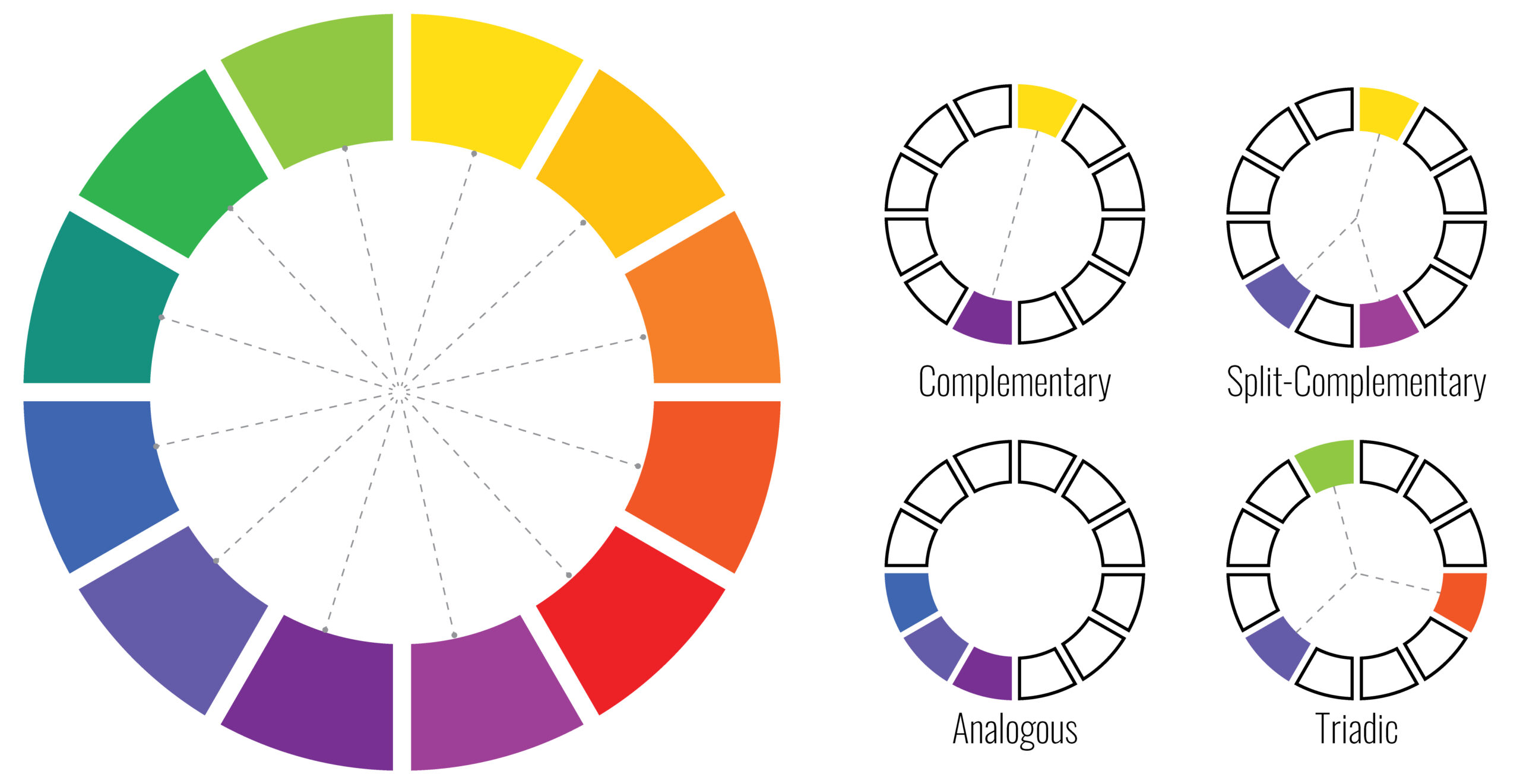
Complementary colours:
Appearing opposite on the colour wheel, these colours create the greatest contrast when placed next to one another. Spaces that use complementary colour schemes become bold, chic, expressive areas that draw attention.
Split-complementary:
This model offers a more subtle alternative to the contrast of pure complementary colours. Pick a starting colour then, instead of picking the colour directly opposite, use the colours adjacent to this opposite colour. In doing so, you have selected main, secondary, and accent colours that are sure to make your space pop – without being too bold.
Analogous colour:
These colours sit adjacent to one another on the colour wheel, and harmonise together to create a cohesive, subtle palette. Spaces implementing an analogous colour scheme tend to be calmer, more harmonious.
Triadic:
This scheme uses three colours from the wheel at equal distances to another – like drawing an equilateral triangle over the wheel. Spaces using a triadic scheme remain balanced while offering a more exciting contrast of hues, adding a bit more fun to the area.
Using colour theory, any single colour can inform a palette that is as subtle or as bold as your workspace requires.
When it comes to choosing colours for your office or workspace, your first step is deciding on your mission or message. Whether you’re looking to influence employees’ emotions, tell a story, or simply present your company in a certain way, your intent should inform your colour selection – and that swaddle of swatches will become much less mind-boggling.
For more information on Choosing the right colour for your office talk to Business Furniture Direct Limited
Enquire Now
List your company on FindTheNeedle.
