 Add My Company
Sign In
Care Home Brochure Design
28-01-2022

Our Client
Hazelwell Lodge Care Home in Ilminster appreciates that choosing a home for a loved one is not easy. It’s a decision that cannot be taken lightly. It means choosing a place that provides the highest level of care and support to meet their needs and somewhere they can enjoy a happy and fulfilling life. Above all else, the home needs to FEEL RIGHT. It’s vital to Hazelwell Lodge to have the people and surroundings that provide such a service to every individual within their home. Understanding each resident’s needs, preserving dignity and respecting independence enable Hazelwell Lodge to create a real sense of home.
The Agency
Creative Harmony is a brochure design specialist, and our team has worked with many healthcare centres. Our knowledge and experience in this area are key reasons why Hazelwell Lodge approached us to create a new and more appealing brochure and to refresh its branding and logo.
The Outcome
Our design process always starts with discussing with the client their needs and the outcomes they wish to achieve. We explore their intended audience, the voice they want their audience to hear and how they see their brochure.
We take this and work with our talented and experienced team to make their vision come to life. We keep the client involved at every stage, ensuring that they are happy with the progress and the overall direction of the work. This provides a seamless design and creation process. As part of this process we approached Hazelwell Lodge and advised them that their logo needed updating to keep it in line with the company image that we were creating with them. The company agreed and commissioned us to carry out the brand and logo refresh alongside our work on their brochure.
Let us help you with your project
Results
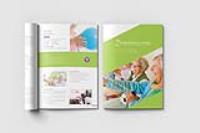
The final result was a clean, modern and refreshing brochure that would appeal to people considering a care centre for their loved one’s health and wellbeing. The brochure is easy to read with detailed information presented in small chunks and interspersed with photographs showing life at Hazelwell Lodge. The colours follow the company guidelines and add depth without being overwhelming.
The newly refreshed logo is clean and simple, incorporating a stylised bird that portrays a dove, a symbol of hope, peace, promise and care in many cultures. It seemed fitting for a company making such a significant promise to look after loved ones who are often frail and vulnerable.
For more information on Care Home Brochure Design talk to Creative Harmony
Enquire Now
List your company on FindTheNeedle.

