 Add My Company
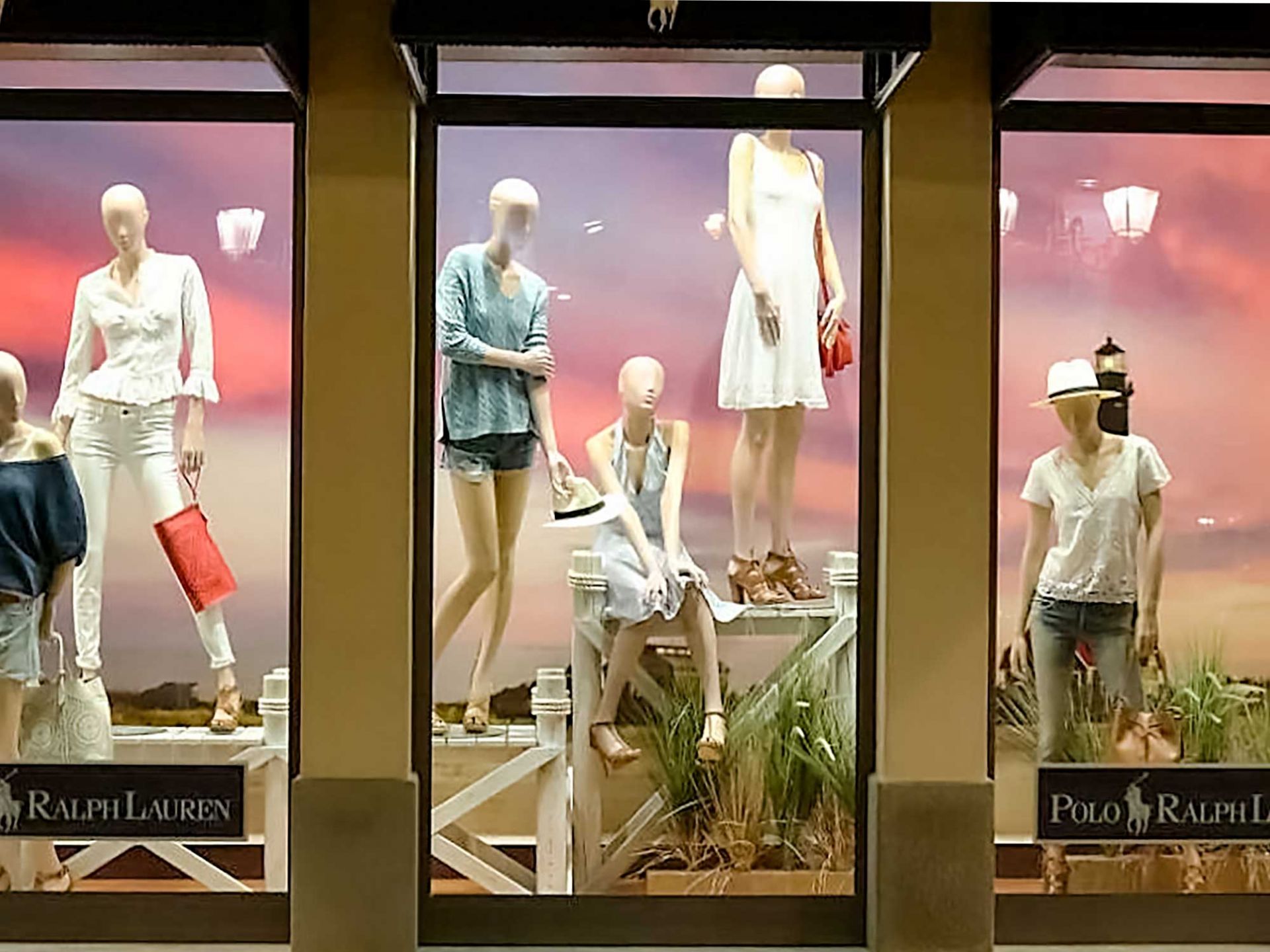
Shop windows are one of the most important marketing tools for high street retailers, which were utilised long before the advent of the Internet. They have a very important effect on sales performance to this day.
For this reason, it is important to follow some unwritten rules of window merchandising to create impactful retail window displays.
In this post, we have collected the most important ones for you.
What is the purpose of a window display, and what does it tell about the business?
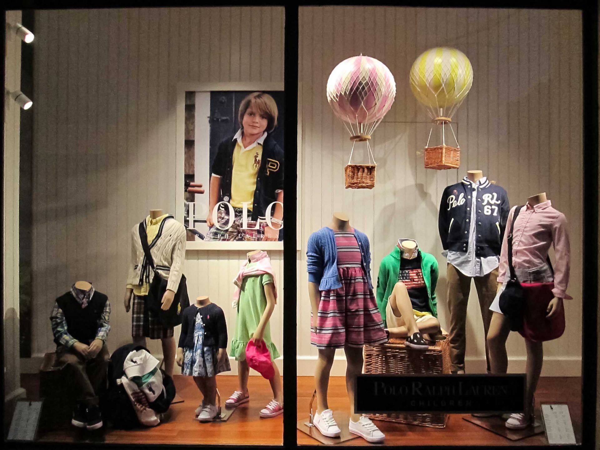
Window displays encourage people to shop. They have an impact on bypassers through their atmosphere.
The secret to creating an appealing atmosphere is to display the right products, props and decoration elements in the right place at the right time.
A retail window display is like a book cover. It is what the potential customer sees for the first time, on the basis of which they form an opinion without even setting foot in the store. It has the power to make them buy from you even without originally planning to.
A well-decorated shop window with aesthetically placed products and display props is a great opportunity to attract customers. You can present the style of the store, display your most popular products, draw attention to sales and give a little insight into your store. If you're good at it, you can get a lot of customers.
Why is window merchandising important from a marketing point of view?
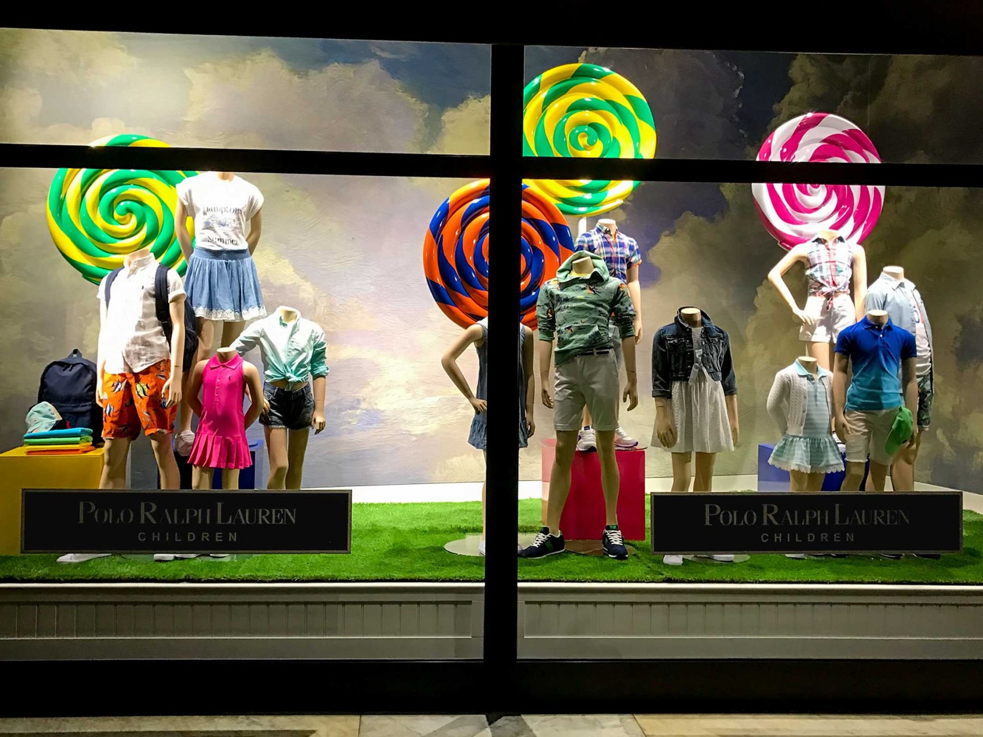
A good retail window display supports the promotion of your business in many ways. That is, if you use it skillfully, can be a great marketing tool.
One of the most important things about shop windows is that they have an effect outside of opening hours.
When the store is closed, passers-by can still view the window, find out about the prices and see the current product range. Hence, the shop window is a permanent advertising space.
In addition, the shop window also greatly contributes to impulse buying. Someone may have just gone to the bakery, but spotting a discounted handbag in the shop window can make them change their original plan and come to you.
In addition to these, a shop window is a tool that can be changed quickly and easily, so it can always be current. Numerous pieces of research have concluded that just after rearranging a store’s window, its traffic increased significantly compared to the days before. This increase is mainly aimed at displayed goods, but it has a knock-off effect on other products as well.
What should you pay attention to when planning your product display?
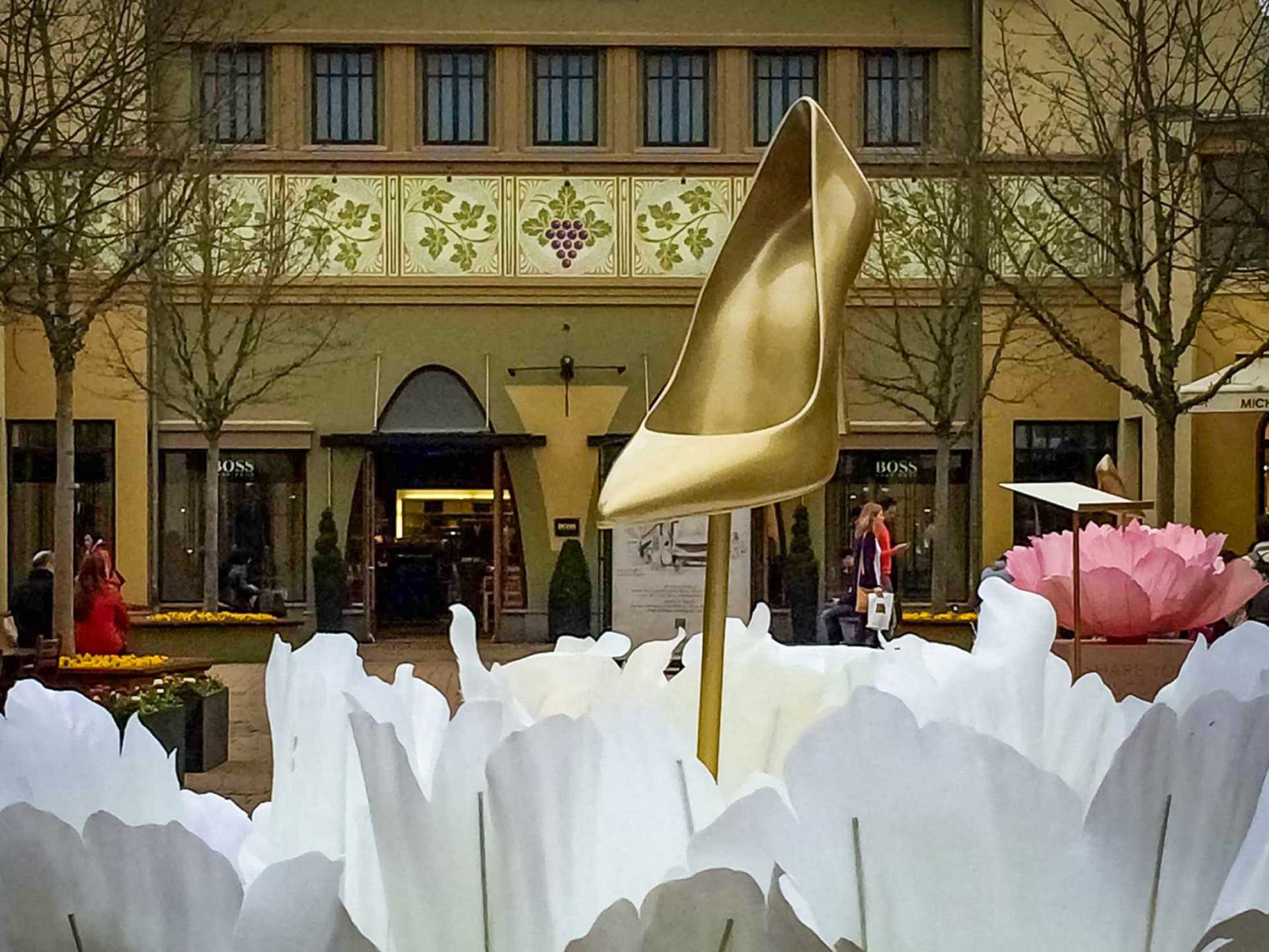
It is worth following some basic rules in order to get the most out of the store window design.
Let's see what the rules of window merchandising are:
1. Assessment of the available space
Even before you start doing anything, it is very important to measure how much space you have available and what you can aesthetically achieve from your ideas. Keep in mind that while attention-grabbing is important, crowding should definitely be avoided.
2. Selection of products
It is worth choosing the products according to a certain concept. This way you can create unity in this area as well as make your work easier. It is not an easy task to choose to display products.
Tip: you can focus on the current sales or the upcoming festive mood, whether it's Valentine's Day, Easter or Christmas. This way you already have a guiding thread, based on which you can choose the right products.
It is worth first listing all the products to be displayed and only then starting to organise how they are showcased, so it is easier to maintain the basic concept.
3. Development of the design concept
There are golden rules for setting up a shop window that goes beyond simple product display, and you should stick to them.
Harmony
This is the first and most important thing! The goal is that the window display catches the eye and radiates harmony. If you don't have the balance and you see a little chaos in front of you, you've already lost a potential customer.
Focus point
It is also important to have a focal point of the space, on which the eye is first drawn, and to prepare the rest of the display accordingly. The most important design element, the most valuable information or the best-selling product can go here.
Contrast
In terms of appearance, the existence of contrasts is also important. With this, you can not only add a lot to the harmony, but at the same time, it also makes the set of goods displayed more transparent. If you place light goods and props in front of a white background, you will certainly achieve less success than if you include a darker shade in the story.
Appropriate colours
And at this point, we have come to the issue of colours, which are also very important. Make sure that you choose no more than three-four matching colours for the shop window.
Another aspect is that these colours must also resonate with the brand image and store colours. If the shades used are clashing with the colours of the rest of the store, then no matter how hard you try, the overall image will never look good.
For example, even though red, white and green are the colours of Christmas if the shop's colour scheme is dominated by purple, it is worth designing the overall look of the festive shop window accordingly.
4. Grouping of products
Sort the products into groups according to a rule you define before placing them in the display window.
If, for example, you organise them by size, colour or type, you help the viewer to see more easily all the goods that you want to show them through your window display. In addition, thanks to this, the entire composition will convey an organised overall picture.
5. Arrangement of the products
The most popular way of placing products is the pyramid shape. The essence of this is that you place the largest product in the centre and, moving sideways, increasingly smaller ones are placed next to it.
If the goods are almost the same size, then it is worth including decorative elements, so you do not have to give up this form of arrangement.
If the pyramid is symmetrical, it radiates calmness, if it is asymmetrical, it creates a much more energetic and moving effect.
In addition, if you are thinking about more serious decor elements and backgrounds, you can also choose the method of placing the products in an airy manner. In accordance with the created space, you can also line them up according to the extent of the sale.
What are the biggest no-nos in window merchandising?
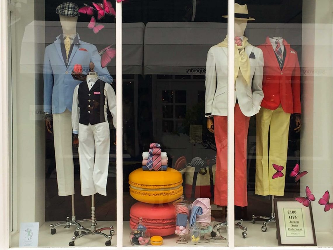
If you display products in the shop window without a concept or thought, it can easily create the feeling that you are looking into a warehouse.
The most important thing is not to try to show everything at once on this platform, leave products in the store as well.
Whatever concept you decide on, the biggest mistake you can make is if your shop window gives the impression of being unpretentious. In order to avoid this, it is important to have the right arrangement, the preliminary selection of decorative elements and colours and the creation of harmony.
Remember, the shop window is an important marketing channel that tries to capture the attention of your potential customers every minute of the week, so a lot of emphasis should be placed on making it look good.
As you can see from some of our previous work above, we at Spur Creative have worked with various high-end retailers to help them make their shop windows spectacular with custom-made retail props. You can see a wider selection of our work here.
For more information on The Rules of Creating Effective Retail Window Displays (Through a Prop Maker's Eyes) talk to Spur Creative Group

