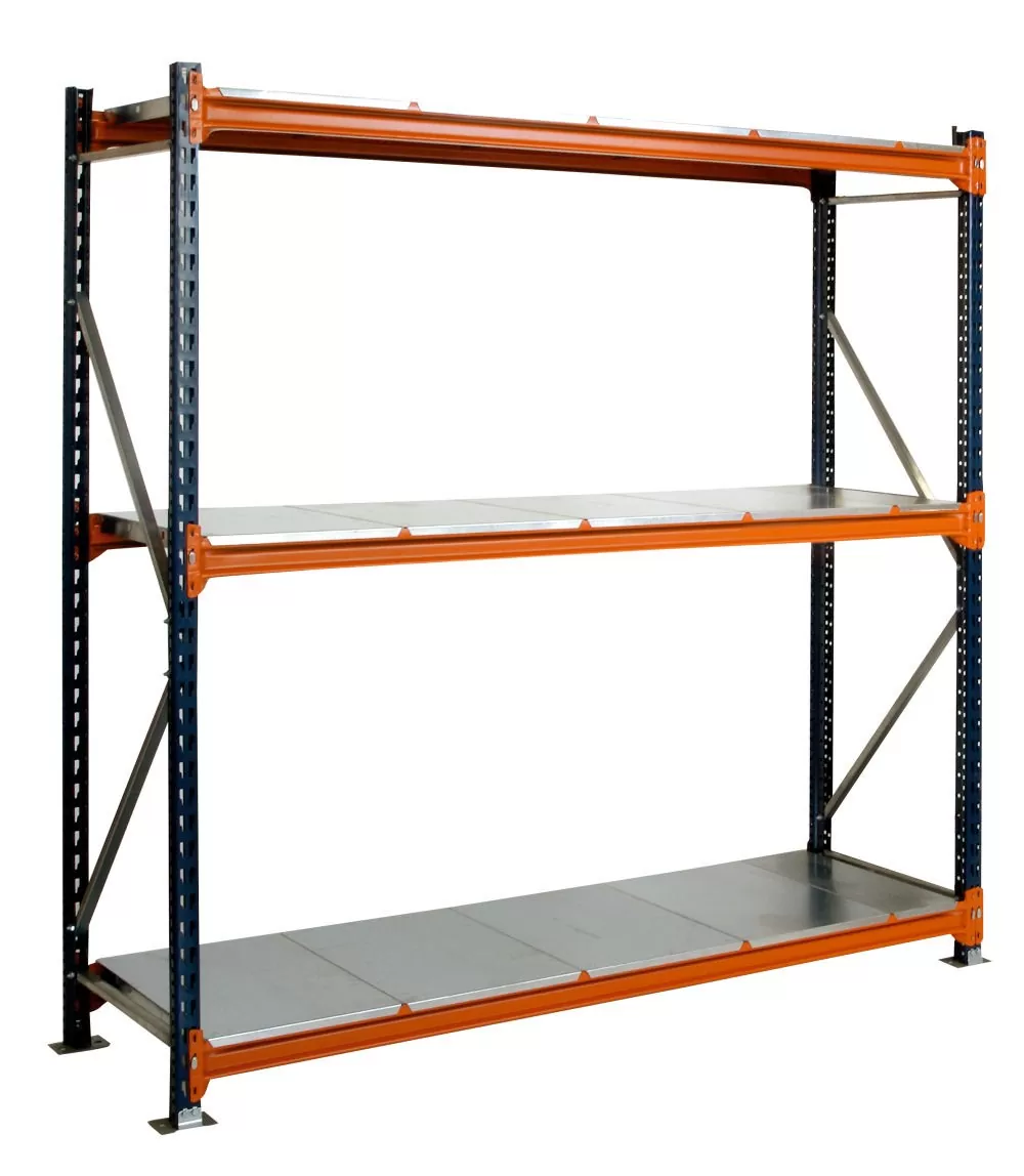
Despite being a relatively simple concept, commercial shelving is a vital part of the retail experience for more reasons than the obvious.
Whilst it is somewhat of a truism that the vast majority of high-volume retail establishments need shelving units on a practical basis, there is more to their use than just stacking products on them.
In fact, many savvy stores use their shelves, in terms of size, placement and location to sell more products and generate more revenue.
Here are some of the ways in which shelves are used strategically to take advantage of shopper psychology and sell more products.
Eye Level Is Buy Level
The golden rule that so many stores use, particularly greengrocers and supermarkets, is that whatever products they want to sell the most are placed at eye level to immediately catch the customer’s eye.
This typically means that branded goods and higher profit margin items tend to be placed in the middle of an aisle, often to the right of where the customer is expected to enter on a typical shopper journey.
However, there is more to this than just placing items around five feet, six inches off of the ground, as the shelves immediately above and below are also great vectors to capture a customer’s attention, and not just because people are often taller or shorter than the average.
Shelves are often pointed slightly down to help certain retail items, which whilst designed to make it easier to make shelves look full, also has the side effect of making customers look down to the items below them. They will often look down to examine prices as well.
Besides this, the main eyelines shops focus on are not just those of the shopper but of their children, so certain types of items designed to appeal to kids are put at either waist height, where a child would be sitting in a trolley, or on the lower shelves where kids might be walking around.
This is why brighter, colourful items are placed lower down.
Occasion-Based Placement
Whilst most shelves are set up based on collections of associated products, one trend that has been attempted by small, and mid-sized stores in particular is placing items close together based on a particular shopping journey.
A good example of this is supermarkets that will sell a pre-packaged meal, side dishes, and drinks all in the same place, typically going so far as to provide a discount for the group together.
Pairing meal kits with the additional items you need to complete them is also a common tactic, such as a fajita kit with the salsa, sauces, tortillas, vegetables and meat needed to cook it. It can be something as simple as pairing drinks with snacks.
All of this is to take advantage of the limited time customers will spend contemplating their purchase and inducing impulse buys at every part of the journey.
This is where the shelving above and below the primary items comes into particular prominence.
Standouts And Association
There is a certain visual language associated with shelving and one of the biggest of these is the use of brighter colours and larger signage next to certain items will increase sales significantly.
This is because brighter colours such as yellow are associated with sales and special offers, but this effect can take place even if there is no actual saving. One Tesco shop managed to achieve the same effect with a warning to thieves.
For more information on How Retail Shelves Are Used To Sell More Products talk to UK Shelving Ltd