 Add My Company
Sign In

Most of you are probably already aware, but for those who aren’t, Pantone have announced their ‘Fashion Color Trend Report for Spring 2018’, which is ever so exciting!
Why do Pantone do these trend reports?
There is more info about why Pantone do this report in our previous blog, ‘Have you checked out Pantone’s Fall 2017 Fashion Colour Report’, but as a quick explanation, the report offers a colour overview which highlights the top colours fashion designers showcased at NY Fashion Week.
What’s on trend for next year?
There has been a recent trend in consumers truly embracing colour and designers are fully aware that they need to show more colour in their collections which is evident in the Spring 2018 report.
Does this mean goodbye to neutral and classic shades?
Pantone are not ignoring the neutral or classic shades, as these are the core basics and seasonal essentials. These shades work well on their own as well as providing the landscape for colour complexity.
Need evidence? Take the addition of Pantone’s four classic colours in the report, which has never been done before as evidence. The colours chosen transcend all seasons and provide structure to any wardrobe.
Which shades have made it into the report?
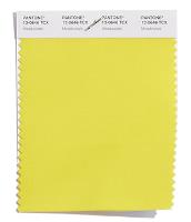
PANTONE 13-0646 Meadowlark – Such a lovely shade is Meadowlark. It is confident and outgoing, this bright yellow shade highlights the spring season, giving joy and illuminating the world around us.
For more information on Pantone have announced their Fashion Colour Trend Report Spring 2018 talk to VeriVide
Enquire Now
List your company on FindTheNeedle.
