 Add My Company
Sign In

It had to happen sometime! Facebook have begun rolling out a new layout for Facebook Pages in 2016.
We first noticed the changes last week on a client’s page layout; now our Odyssey New Media Facebook Page has been updated.
In this post, we review the changes to our page and summarise the most important areas which have changed. Business owners need to review these changes to make sure their page images and content look good and they are emphasising relevant tabs and messaging correctly.
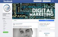
Here is a screenshot of our Facebook page with the new Facebook layout (numbers are for referencing below):
New Facebook Pages Layout-2016-odyssey New Media Facebook Page 811x1024
1) Much Clearer Page Cover Photo
Previously the logo was overlayed on top of the cover photo. The new layout means that the Logo has been moved alongside the cover photo on the left-hand side which means the entire cover photo is now visible. This is prime real-estate for getting a strong message across to visitors now, so many brands should think about updating their cover photo to take advantage of the change.
2) Logo Image Has Been Moved to the LHS
As mentioned before, the logo used to be overlayed in the bottom left-hand side area on top of the cover photo. Now the Logo is standalone on the left-hand side column area. The logo size has also been increased slightly, meaning anyone who uploaded a smaller image may see some loss of clarity. Our logo wasn’t affected by the change and still looks sharp and crisp on most monitors.
3) Clearer Page Tabs – Ordered like a Menu on the LHS
The page tabs which were underneath the cover photo previously now appear on the left-hand side menu underneath the logo. Every single tab appears to be listed; these can be removed if they are old and redundant.
We really like this and we feel it will emphasis tabs like services and reviews more. Facebook are definitely setting up pages more like ‘mini-websites’ with this left-hand side menu.
4) Like, Message and Share Buttons appear underneath Cover Photo
Previously the ‘like’, ‘message’ and ‘share’ buttons were overlayed on the cover photo and center-right aligned. Now they are still underneath the cover photo but are aligned to the left. In future, this could allow for 1-2 more menu items alongside if Facebook think of something else to put there – e.g. ‘checkout’ might be an option if they enable retailers to take sales transactions through ecommerce style Facebook pages. Watch this space!
5) The Call-To-Action Button is Bigger and moved to the RHS
The call to action button was previously overlayed on top of the cover photo and wasn’t very prominent. Now Facebook has made this much bigger and aligned to the right-hand side with a clear blue colour.
We expect this to generate a lot more clickthrough-rate (CTR) and conversions as a result given its prominence on the page.
Facebook have also included more variety of call-to-action buttons to choose from. These include: ‘Book Now’, ‘Call Now’, ‘Contact Us’, ‘Send Message’, ‘Use App’, ‘Play Game’, ‘Shop Now’, ‘Sign Up’, ‘Watch Video’, ‘Send Email’, ‘Learn More’ and ‘Request Appointment’.
Facebook Pages New Layout Edit Call-to-action Button Options
6) Your Facebook Page Business Category is Emphasised
The Facebook business category is now right-hand side aligned and placed below the call-to-action button. We feel this greatly emphasises the business category compared to the previous layout.
7) Search Bar – Search for Posts with Certain Keywords
The search bar that has been added to the right-hand side enables people to search for keywords and keyphrases in your post content. This is a great feature, especially for visitors who are looking for specific content related to a product or service they require. We expect this to help raise impressions on older posts and even result in more shares of content from older posts.
8) About is now Placed on the RHS
Previously the About section was less prominent and could get lost amongst the other tabs. With this new layout the About section is clearly available and easy to access. All content is also segmented using a tab layout once the user clicks through on ‘About.
Facebook Pages New Layout about Edit Tabs
9) Top 3 Apps are Listed on the RHS
With the new Facebook Pages layout all of the apps and tabs are listed on the left-hand side menu as text menu items.
Full visual versions of tabs/apps like ‘images’, ‘likes’, ‘reviews’ can be displayed on the right but only for your top 3 that you define as wanting to highlight.
We hope this gives you a brief overview of the current updates. Just to emphasise, every business or Facebook Pages owner should review their page ASAP to ensure that images, layout, info and apps are displaying correctly and make any adjustments they need to.
For more information on Facebook Launches New Facebook Pages Layouts for 2016 talk to Odyssey New Media Ltd
Enquire Now
List your company on FindTheNeedle.
